We have got some very exciting news to share today - MayaData has a whole new look.
As we continue to grow we want our brand to look consistent throughout and have a story, a meaning in its identity/icon with which we can relate to - A brand that reflects what we do, what we believe in and why we exist.

We, as a company, have grown up over the years and the existing Mule (mascot and identity) being the first identity we were connected to it. We hesitated to give up on our mule. It’s funny and cute look had got the attention of many people. They started recognizing the mule in all those major events, especially in Kubecon. We had to give up on our mascot, as our open-source project OpenEBS was sandboxed by the Cloud Native Foundation (CNCF) to which the mule was connected to. While the Mule remains the logo of the CNCF project, OpenEBS, MayaData needs a cleaner logo that better reflects our mission to deliver data agility.


If it was, then why changing the brand identity was required?
Marketing Challenges:
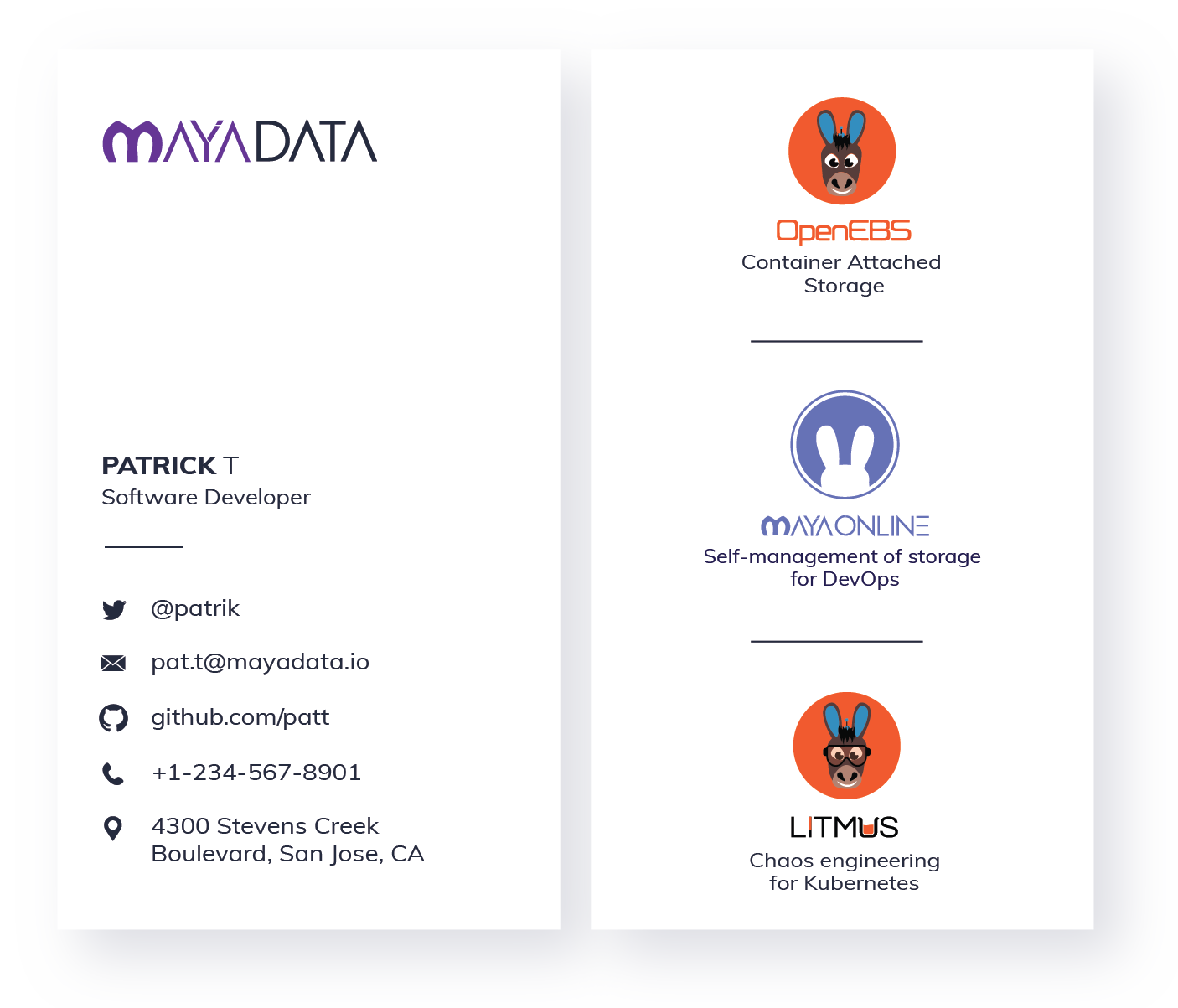
MayaData has many different projects and products. With the years of growth and releases of different products/projects at different times, the existing identity/logo of the company couldn’t blend well with the rest of the new launches. Guidelines never existed and with the new designer’s coming in, it started becoming a challenge in terms of what goes where and how. For example, over the websites, marketing and printing collateral, business cards, for different colored backgrounds and so on.
Design Challenges:
We had a few broken pieces in terms of consistency, design, contrast, form and different typeface for each logo. It was not a clear representation of what we do. It wasn’t simple and distinctive, something which could do the job better. It turned out to be limiting the usage. It failed the contrast ratio on many of the darker backgrounds.


You now know about the real pain of a designer! The situation was something like looking for an oasis in the middle of the desert.
So, we decided to act on it and convince everyone afraid of this change. Since we believe “Change is the only constant”.
Let’s move forward…
The new logo is a representation of what we as a company do and want to achieve. Before starting off with the design we had picked a few keywords that could help us achieve the form.
KEYWORDS

An end result is a form of visual clarity and with a handful of a modern twist - one that can scale easily and work better in various places.
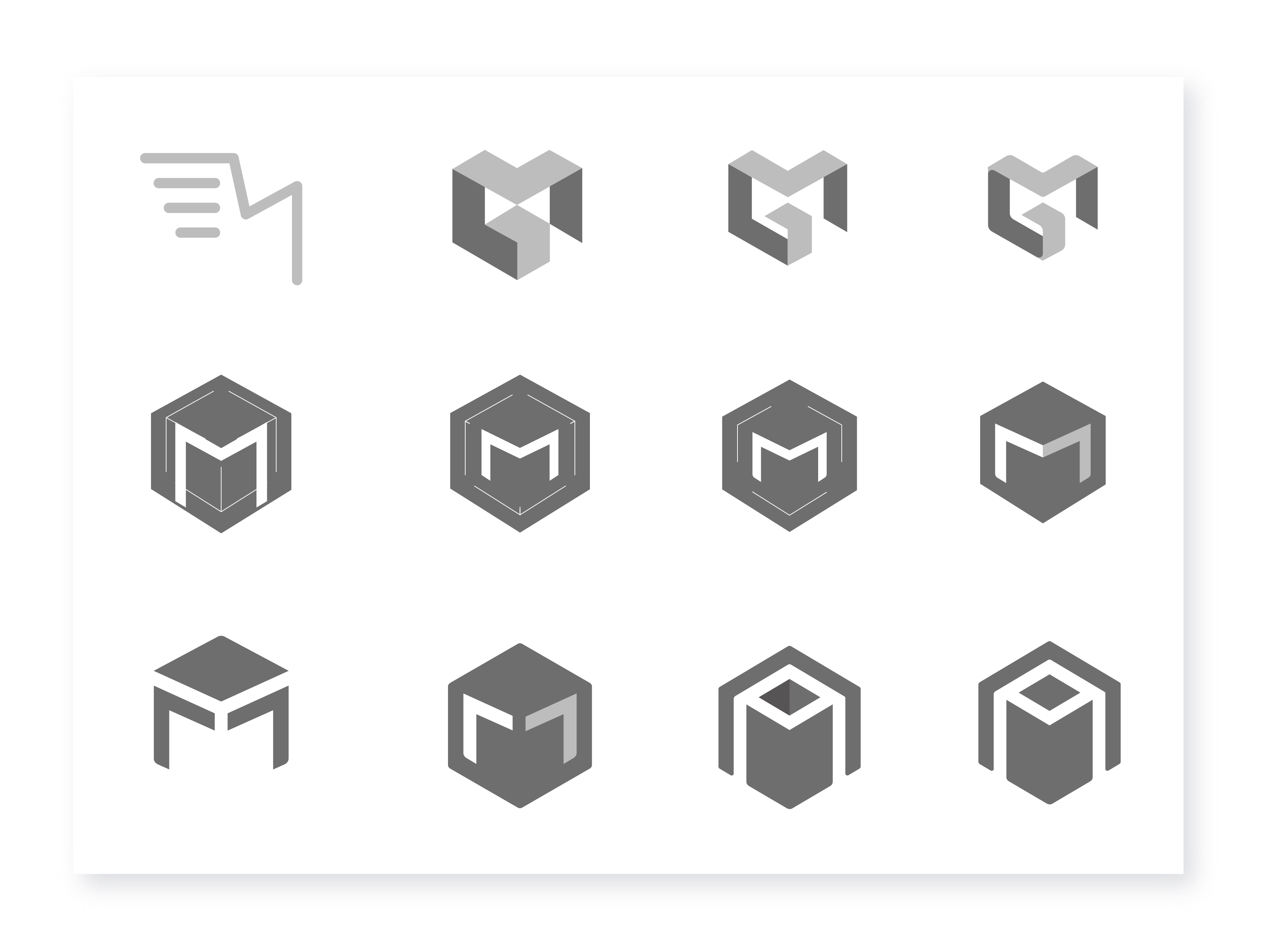
Form development and form refinement
CONCEPT BRIEF
The name MayaData - In Sanskrit Maya means Magic - and our goal is to delight users with a magical experience.
The empty space between both the boxes gives a representation of letter M. Since, we had M in a mule shaped form in the old logo we wanted to keep that in the new form as well.
If you look at the entire form carefully, it has two arrows pointing upwards to and downwards, which represents agility. When you combine all the pieces together it gives us a connection to the core meaning on which MayaData is built, i.e “Delivering Data Agility”.
Final Logo and variations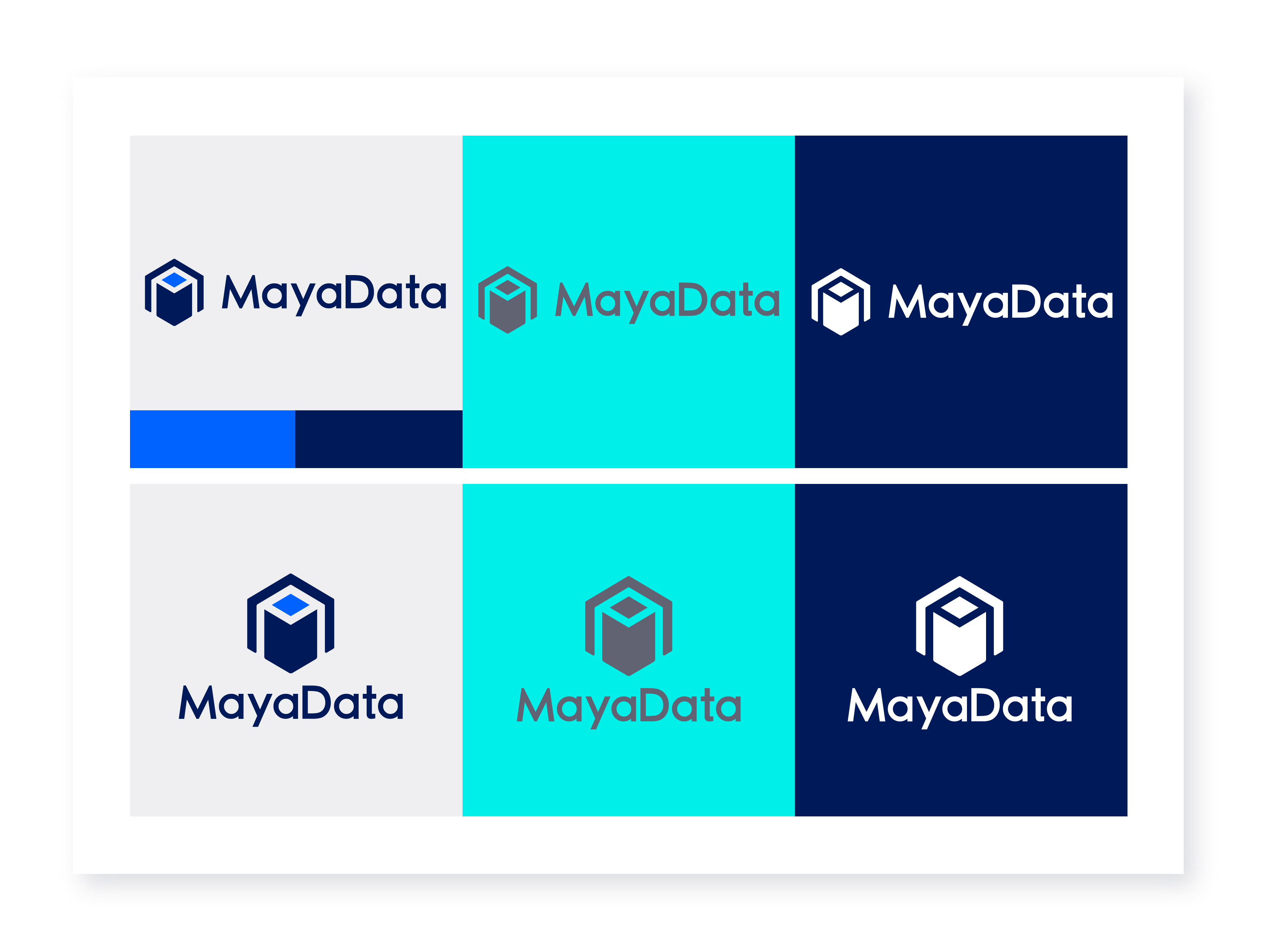
Other Product & Project Logos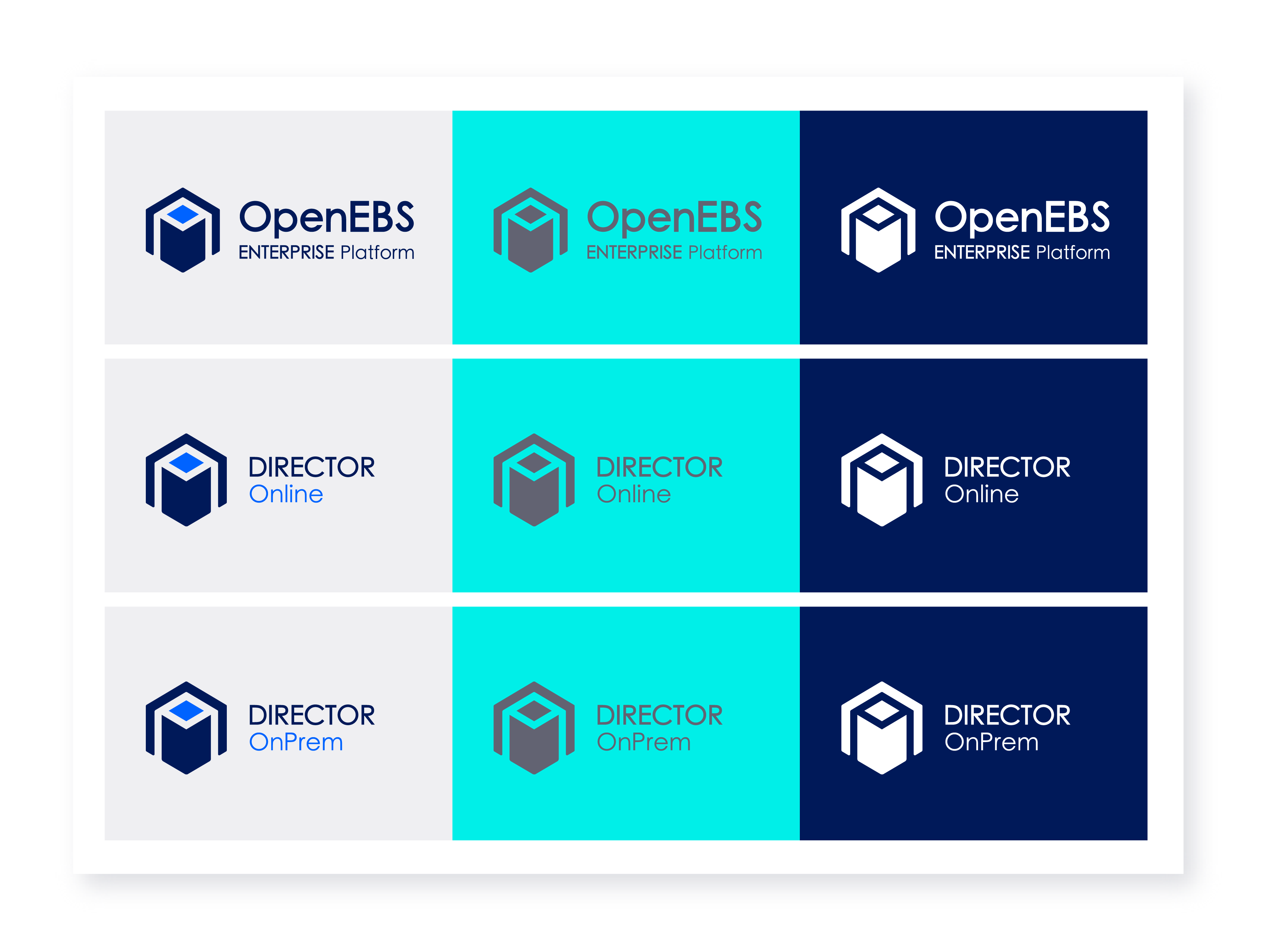
To have more clarity on the usage, please go through the Brand Guidelines.
In the months to come, you'll see a few more visual changes around MayaData orbiting in this new direction; on our websites, blogs, ads, and products (though not in a way that will hamper the critical business of getting things done). I mean, we are still us. But more consistent and strong. Check us out at https://mayadata.io


Game changer in Container and Storage Paradigm- MayaData gets acquired by DataCore Software
Don Williams
Don Williams
Managing Ephemeral Storage on Kubernetes with OpenEBS
Kiran Mova
Kiran Mova
Understanding Persistent Volumes and PVCs in Kubernetes & OpenEBS
Murat Karslioglu
Murat Karslioglu